The Importance of Visual Weight in Composition
Issue 230 — Guiding the Eye for Stronger Photographs
Have you ever looked at a photo and found your eyes instantly drawn to one particular element? Maybe it was a bright splash of color in the scene, or a face in the crowd that commanded your attention. That pull you felt is no accident—it’s the concept of visual weight at work. Visual weight isn’t about physical weight at all; it refers to how much a given element in an image draws the viewer’s eye. In other words, some parts of a photo feel heavier or more noticeable than others. Understanding this concept can be important for your composition. As photographers, if we know what will attract the eye most, we can arrange our shots so that the most important things stand out and nothing distracting steals the show. It’s one of those subtle techniques that can make the difference between a flat snapshot and a captivating image.
What Adds Visual Weight?
Not every part of a photo is noticed equally. Here are some common traits that can make an element visually “heavier” in your image:
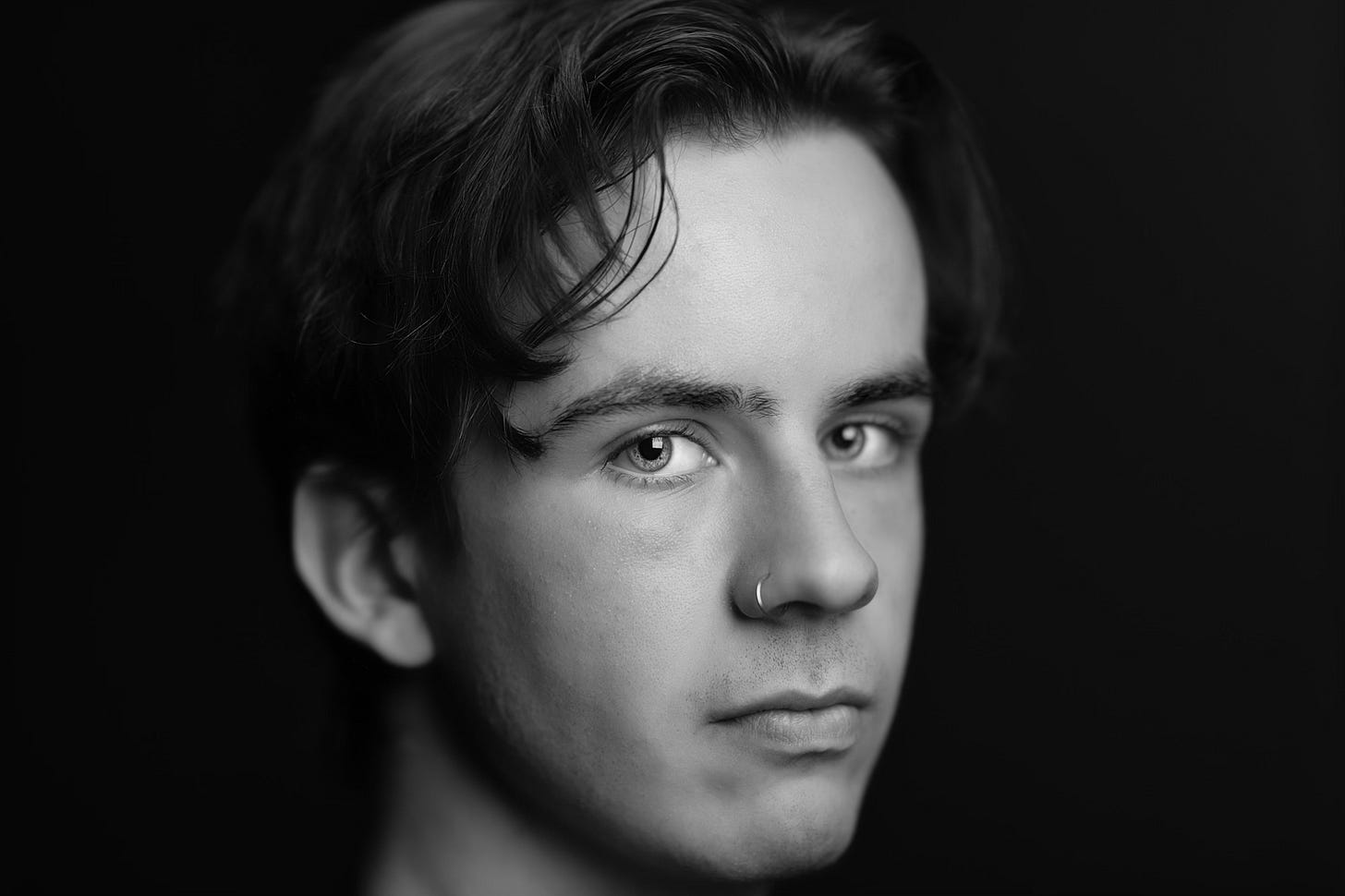
Brightness & Contrast: Bright highlights or strong dark-light contrast quickly grab attention; for example, a bright subject against a dark background will immediately draw the eye.
Color: Bold, saturated colors stand out, especially warm hues like red or orange. Cooler or muted tones tend to carry less weight in comparison.
Size: Larger subjects draw more focus than smaller ones. An object that fills a good portion of the frame will demand attention first.
Sharpness (Focus): A tack-sharp subject in focus has more visual weight than anything blurry or out of focus. Our eyes naturally go to the area of highest clarity.
Faces/Eyes: We are instinctively drawn to people and animals. If there’s a face or even just eyes visible in a scene, it will usually command a lot of attention.
Texture & Detail: Areas with rich texture or intricate detail attract the eye more than flat, smooth areas. A busy, textured pattern can feel “heavier” than a plain, empty space.
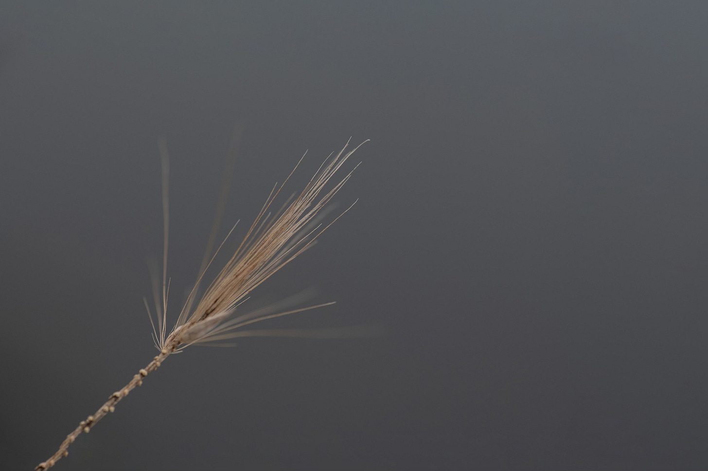
Negative Space: Empty or plain areas in a photo carry very little weight. Clear space around your subject can actually increase the relative weight of the subject by isolating it and giving the eye only one focal point.
By recognizing these factors, you can begin to predict what a viewer will notice first when they view your photo.
Creating Stronger Images with Visual Weight
So, how do you use visual weight to improve your compositions? It starts with being intentional. Before you press the shutter, identify your main subject or point of focus. Ask yourself what you want viewers to notice first. Once you know that, compose your shot to make that subject the visually heaviest element in the frame. This might mean positioning it prominently or making it larger in the shot. It often helps to ensure your subject has some contrast against its surroundings—such as placing it in good light if the background is dark, or vice versa. If the color of your subject doesn’t naturally stand out, consider what you can do: for instance, position it against a neutral background or adjust your angle so that nothing of a stronger color upstages it. You can also use a shallow depth of field to blur out a busy background, making your in-focus subject pop even more. The goal is to deliberately guide the viewer’s eye to where you want it.
Equally important is minimizing anything that might unintentionally divert attention. Take a moment to scan the edges and background of your frame for distractions. Is there a brightly colored sign, a stray person in a red jacket, or a patch of light that’s not part of your intended story? These could carry more visual weight than you’d like. Adjust your composition to deal with them—zoom in or reframe to cut them out, change your shooting position, or use focus and exposure tricks to tone them down. Sometimes, simply waiting for a moment (for that passerby to move, for the lighting to change) can save your shot. By simplifying the scene and eliminating distractions with excessive weight, you’ll create a cleaner, stronger image where the viewer isn’t confused about where to look.
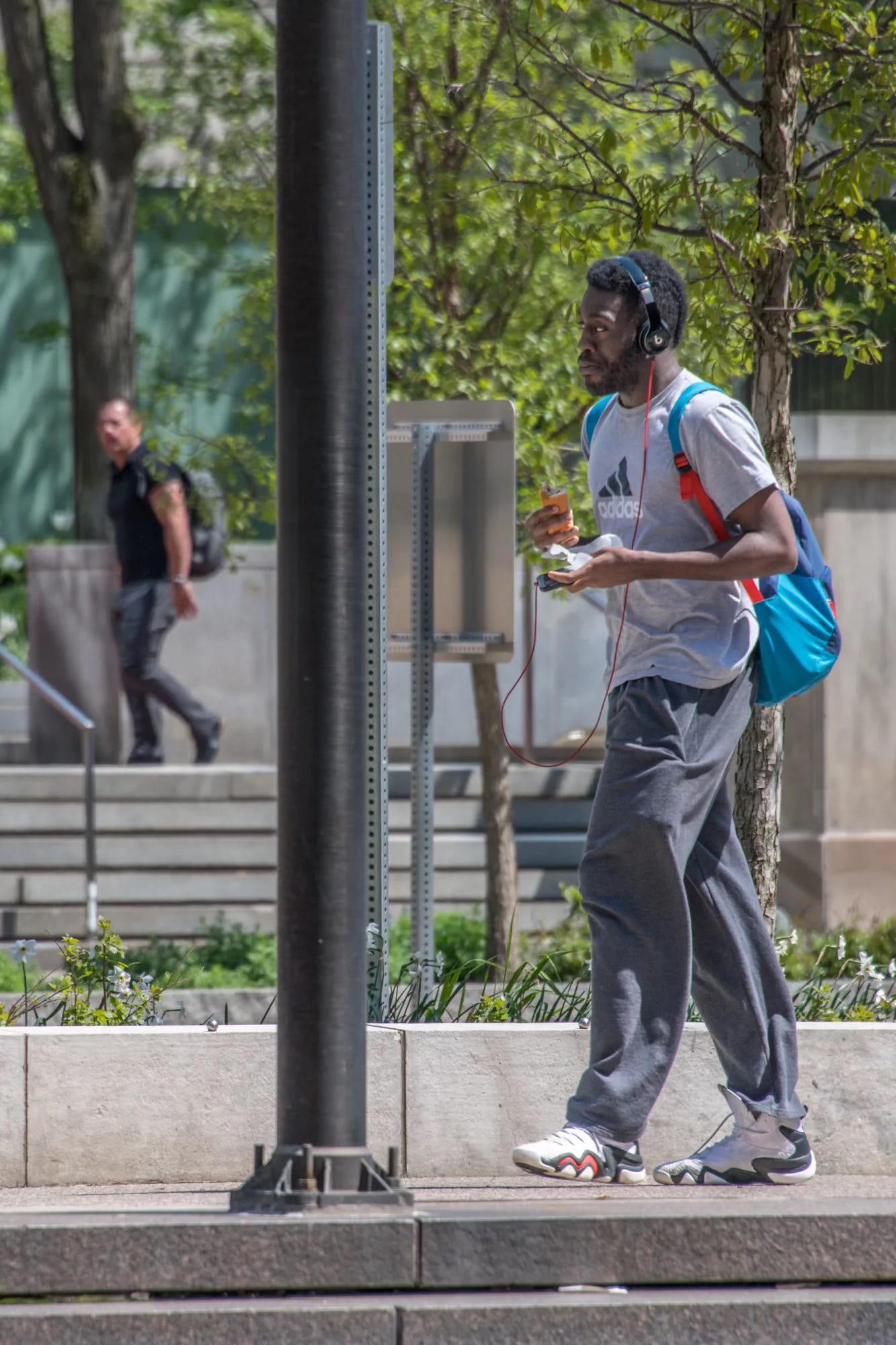
Another aspect to consider is balance. Balance in photography means distributing visual weight in a way that feels pleasing and intentional. If one side of your photo features a heavy element (such as a large, dark subject positioned off to the left), you can balance it by placing a lighter-weight element on the right, rather than leaving the right side empty. For example, a lone tree on the left side of a landscape could be balanced by a more petite, distant figure or a lighter object on the opposite side. Or, in the case of the photo below, the larger person to the right is balanced by the smaller, more distant person on the left.
Even negative space can act as a counterweight if used thoughtfully—an expanse of open sky or an uncluttered background on one side can balance a subject on the other side, giving the image breathing room and harmony. When a photo’s visual weights are balanced, a viewer’s gaze will comfortably travel around the frame, taking in the whole scene. Nothing feels jarringly heavy or out of place.
Of course, balance isn’t a hard rule that you must follow every time. Sometimes a bit of intentional imbalance can make a photo more dynamic. You might choose to let one element dominate the composition to create tension or drama. A portrait with a subject’s face filling the frame in one corner and nothing but darkness elsewhere can be arresting precisely because of its imbalance. The key is that you, the photographer, are doing it on purpose. Whether you balance the weights or artistically break the balance, being aware of visual weight means you’re in control of how your image feels.
In the end, knowing about visual weight is all about control—control of where the viewer’s eye goes and how they experience your photograph. A strong image doesn’t happen by luck; decisions like these craft it. So next time you’re setting up a shot, pause for a second and consider: What in my frame has the most visual weight right now? Is that where I want the viewer’s attention to land? If not, think about what you can change. By consciously balancing and emphasizing visual weight in your compositions, you’ll guide your audience through your image precisely the way you intended. The result will be photographs that not only look better composed, but also communicate your artistic vision more powerfully.
Some of the Places You Can Find Me:
My Website: https://www.anthonymorganti.com/
My YouTube Channel: https://www.youtube.com/@anthonymorganti


Your photography craft tutorials on Substack I think are the best on the web (including YouTube).
Your reference to scanning the edges and background of the frame reminds me of one of Jay Maisel’s sayings: “Your responsible for everything within the frame, including the parts you aren’t interested in”.