
Stephen Shore and the Challenge of Red
Issue 228 — Why one of photography’s most powerful colors is also the hardest to control.

All images in this edition of the newsletter are copyrighted and are the property of their respective photographers.
Yesterday, I stumbled across an article that stopped me in my tracks: “Stephen Shore On the Color Red” in Aperture. Shore is someone whose voice always makes me pause. He’s been shaping photography for decades. Edward Steichen bought one of his prints when he was just fourteen. By the age of twenty-three, he had a solo show at the Metropolitan Museum of Art, something no other living photographer had done in forty years. His book Uncommon Places changed how we see everyday America, and his teaching has influenced generations. When Shore talks about color, I listen.
Here’s the article if you’d like to read it:
In it, Shore explores why red is such a difficult color to work with in photography. He starts with a line from William Eggleston: “I knew that red was the most difficult color to work with.” Shore explains why. First, red dominates. It grabs the eye in a way no other color does, and if it isn’t used deliberately, it can upset the balance of an image. Second, both film and digital sensors often fail to capture the subtle tonal variations in red. Instead of a rich, dimensional color, the reds appear clipped and flattened. A red shirt or a red wall can quickly look like a flat block of paint with no depth. Shore illustrates this with examples from Eggleston’s photographs, as well as his own, where the effect is clear.
Because of this, Shore admits he often avoided red unless it added something essential. When used with purpose, it can be a powerful tool. When it isn’t, it can ruin a picture.
That insight holds true across different kinds of photography. In street photography, red shows up everywhere: stop signs, traffic lights, buses, and shop windows. If you don’t account for it, red can hijack your frame and pull attention away from your subject. Some photographers lean into this, letting red become the focal point, while others wait for the distraction to move out of the shot.
In portrait photography, red can be both a friend and a foe. A red shirt or lipstick can flatten out just as Shore describes, overpowering skin tones and drawing the eye away from expression. But used carefully, say, a red accessory that draws attention to the subject’s face; it can strengthen the image.
Product photography presents a different challenge. A red item needs to look dimensional and appealing, but cameras often fail to capture its tonal range. Without careful lighting and exposure, the product looks dull and flat. This is where technical skill really matters, because clients expect the red to look alive.
Even in landscapes, red plays a tricky role. Autumn leaves, desert rocks, or a red canoe on a lake can add a striking accent. But if it’s too dominant, it can make the scene feel unbalanced. Shore’s advice—only let red in when it contributes to the structure—applies here as much as anywhere else.
Reading Shore’s reflections made me think harder about my own use of color. I often ask myself: When red appears in my frame, is it enhancing or detracting from the image? Is it adding structure, or is it just shouting over everything else?
Red is one of the most powerful tools we have as photographers, but it demands precision. Handle it with care, and it can make a photograph sing. Handle it carelessly, and it can become flat or distracting. That tension is exactly what makes it so fascinating—and so worth paying attention to.
Here are a few iconic photographs where red takes center stage—images you could reference or even share alongside your newsletter to give readers a strong visual anchor:
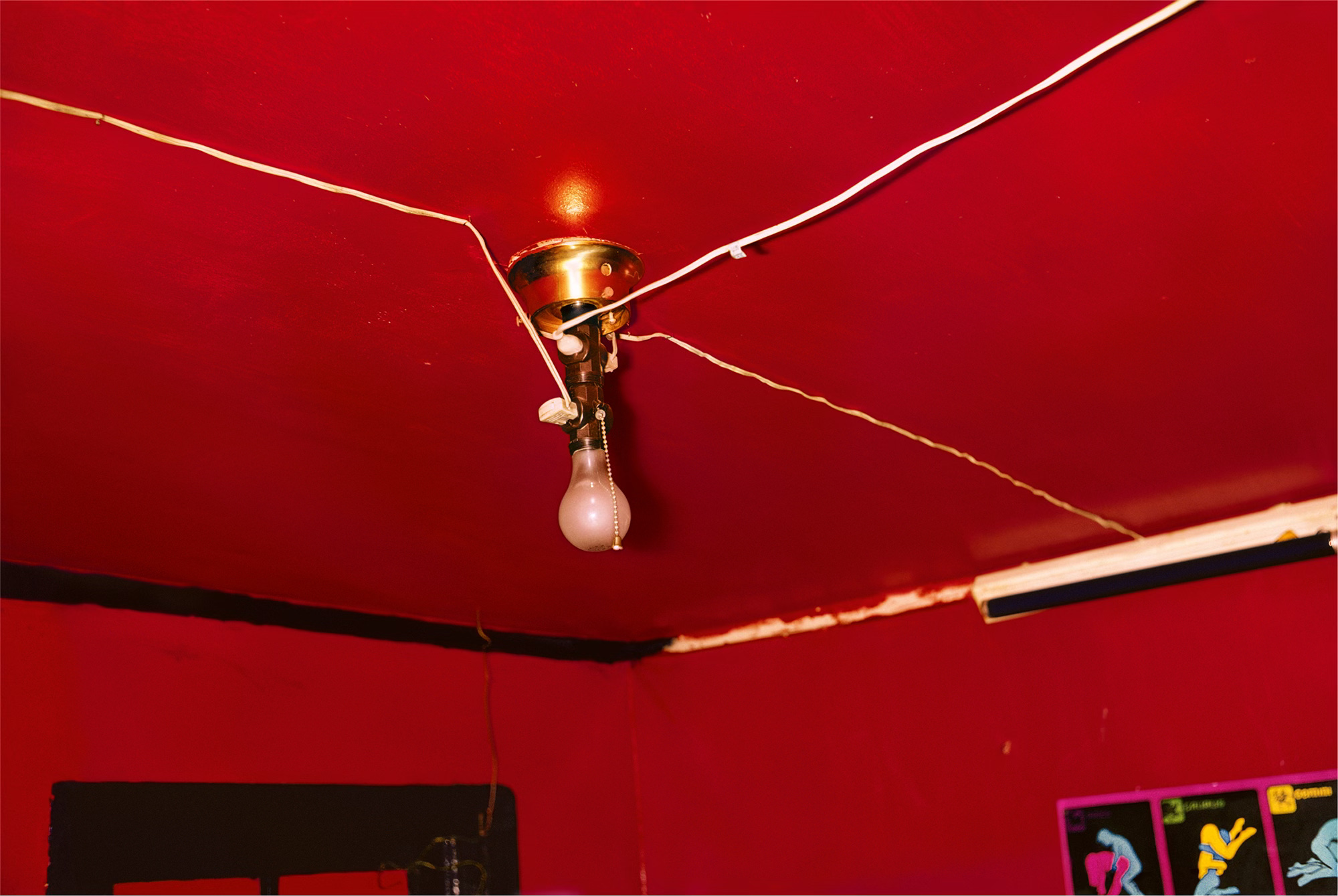
William Eggleston – “The Red Ceiling” 1973
Sometimes referred to as Greenwood, Mississippi, this photograph of a deep red ceiling, illuminated by a single light bulb, is one of Eggleston’s most famous works. The intensity of the red is so strong that even Eggleston himself said, “I’ve never seen it reproduced on the page to my satisfaction.” It perfectly illustrates Shore’s point about how difficult red is to render without losing depth.
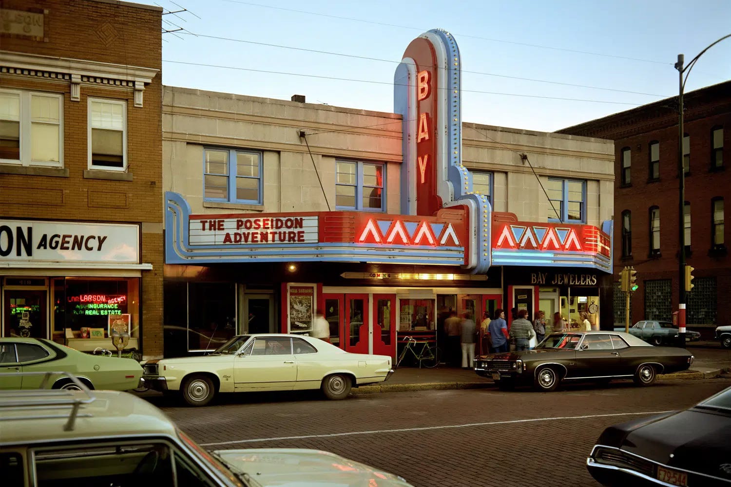
Stephen Shore – “Bay Theater, Second Street, Ashland, Wisconsin” July 9, 1973
The red doors and marquee of the theater contribute to the scene without distracting from it, immediately pulling the viewer’s attention. Still, Shore balances it with the subtle tones of the street and surrounding architecture. It’s a great example of red used as an anchor rather than a distraction.
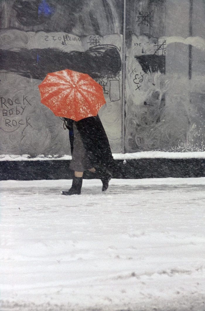
Saul Leiter – “Red Umbrella” 1950s
Leiter often used red in a softer, painterly way. His photograph of a figure holding a bright red umbrella in a snowy city scene shows how red can create mood and atmosphere without overwhelming the composition. The umbrella draws the eye but still fits seamlessly into the muted tones of the street.
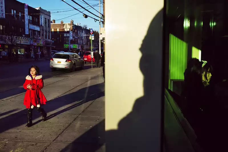
Alex Webb – “Sunset Park” 2014
Webb’s work is known for complex layering and strong use of color. In this high-contrast image, a child in a red jacket walks among the muted tones of the street. Her presence cuts through the busy frame. Red becomes the visual hook that holds the entire scene together.
These examples reinforce Shore’s argument: red is powerful, but it requires control. Each of these photographers handled it differently—Eggleston with intensity, Shore with balance, Leiter with softness, and Webb with contrast.
The next time you look through your own photos, notice where red appears. Does it serve the picture, or does it fight against it? That simple exercise might change how you approach your next shot.
Some of the Places You Can Find Me:
My Website: https://www.anthonymorganti.com/
My YouTube Channel: https://www.youtube.com/@anthonymorganti
Interesting discussion. Early on, I noticed how tricky it was to edit pics when snapping red tulips in the garden and other red flowers. It was quite hard to get the red to look as it did to the eye. Love the examples you shared here where the red really works!
Let’s not overlook that many of Shore’s photographs in the book “Uncommon Places” were not pictures of America; many of the most striking images were actually shot in Canada. The province of Saskatchewan in particular.