
Composing with Crop Guide Overlays: When to Use Them
Issue 224 — ...and When to Break the Rules

Good composition is at the heart of every compelling photograph. Over the years, photographers have developed compositional “rules” – guidelines designed to help arrange the elements in a scene for maximum impact. These aren’t strict laws, but rather time-tested tricks that often make an image more balanced and visually interesting. Every photo editing application, including Lightroom Classic, includes Crop Guide Overlays based on these classic rules, which you can toggle on when cropping your photos. These overlays (Grid, Thirds, Fifths, Diagonal, Center, Triangle, Golden Ratio, Golden Spiral, and Aspect Ratio) serve as visual guides to help you apply compositional techniques and refine your framing.
In this article, I’ll explain what each of these overlays represents, why photographers find them effective, and when to use each one. I’ll also discuss why sometimes the best composition comes from ignoring the guides and trusting your creative instincts.
As I mentioned, every photo editing application has crop guide overlays. To access them in Lightroom Classic, open up the Crop Tool. The Rule of Thirds is the default overlay. To cycle through the others, tap the “O” key.
Grid Overlay – Keeping Things Straight
As the name suggests, the Grid Overlay places a lattice of evenly spaced lines across your image. It resembles graph paper laid over your photo. This overlay is not tied to a specific artistic rule so much as it is a practical aid. The Grid is superb for alignment: use it to straighten a horizon, ensure architectural lines are true verticals and horizontals, or generally check that your framing isn’t unintentionally askew.
I often rely on the Grid when working with images that need exact symmetry or level horizons. For example, when editing a landscape with a horizon at sunset, I’ll turn on the Grid to make sure that the horizon is perfectly horizontal. In architectural shots or any scene with strong geometric lines, the Grid helps keep everything squared up. It’s a simple overlay, but it takes the guesswork out of getting lines straight and balanced in your crop. Whenever precision and symmetry are essential, the Grid overlay is my go-to. With the Crop Tool open, if you bring your cursor just off the image and click, no matter what overlay is currently active, the screen will automatically switch to the Grid Overlay to aid you in straightening the image by dragging up or down.
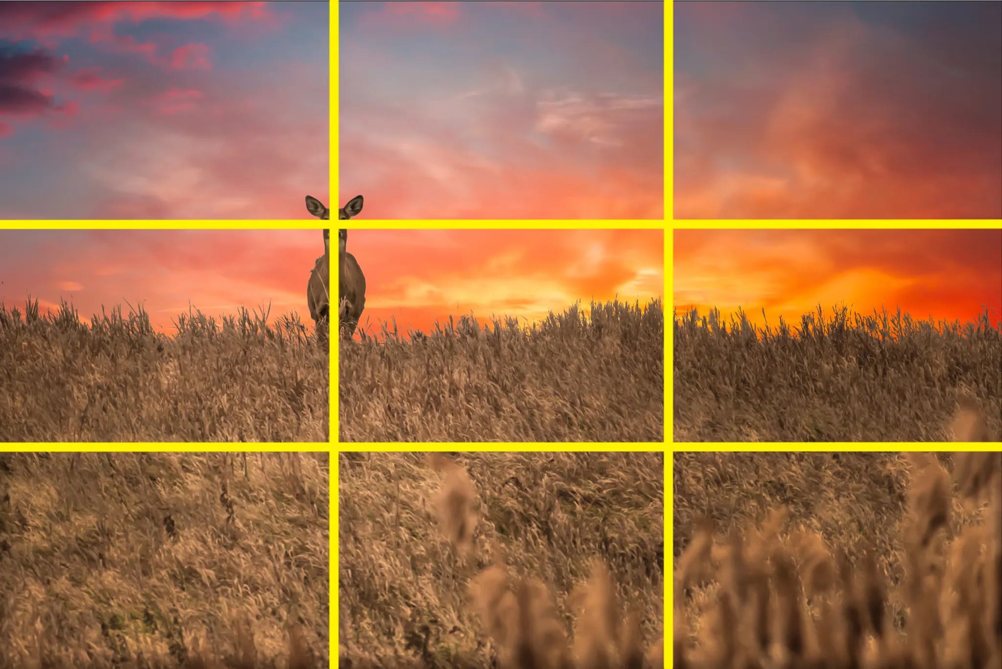
Thirds Overlay – The Rule of Thirds

The Rule of Thirds is likely the first composition rule most of us learn. Lightroom’s Thirds Overlay shows a classic tic-tac-toe pattern: two equally spaced vertical lines and two equally spaced horizontal lines, dividing the frame into nine equal rectangles. The idea is that by placing key elements of your photo along these lines or at their intersections, you create a more dynamic and balanced image than if you centered everything.
Why is this effective? Our eyes tend to find off-center compositions more interesting and natural. Placing a subject at one of the four intersection points (sometimes called “power points”) often gives a pleasing sense of tension and energy. For instance, if you’re photographing a person, you might put their eyes near an upper-third intersection instead of dead center, which can make the portrait feel more engaging. Landscape photographers often align the horizon with either the top or bottom third line (instead of splitting the image in half) to emphasize either the sky or the foreground. In short, the thirds overlay is significant for scenes with a clear focal subject or horizon and when you want to avoid a static, centered look. It’s a gentle reminder not to center everything by default, encouraging you to explore more artful positioning. The Rule of Thirds has been around since at least the 18th century and remains popular because it works so frequently – yet it’s just a guideline, not a mandate, as we’ll discuss later.
Fifths Overlay – A Symmetry Guide

Lightroom’s Fifths Overlay is a less common but handy option. This guide divides the image into five equal parts across and five down (a grid of 5x5). Think of it as an intermediate step between the dense Grid and the simpler Thirds. In practice, the Fifths overlay gives you four lines running vertically and horizontally, which means you get a clear center line as well as lines closer to the edges of the frame.
I find Fifths useful for achieving symmetry and balance. The box in the center makes it obvious where the exact middle of your frame is – perfect if you want to center a subject – while the outer sections help you space out multiple elements evenly. For example, imagine you’re shooting a group portrait or a row of trees: you might compose so that the central element sits dead-center (on the middle fifth), and the flanking elements fall along the lines of the outer fifths, creating a balanced, harmonious distribution. Another scenario is a cityscape where you want the tallest building exactly in the middle and other structures tapering off toward the sides; the Fifths grid can guide that placement. Essentially, the Fifths overlay is about maintaining equal proportions and symmetry across the frame. It’s a guide I turn to when the composition calls for a very orderly, centered arrangement or when I feel the Rule of Thirds is too off-center, but a simple center might be too plain. By aligning elements with the fifths divisions, you can achieve a pleasing order in the image.
Diagonal Overlay – Emphasizing Angles

Composition isn’t all about vertical and horizontal lines; diagonals play a huge role in photography. Lightroom’s Diagonal Overlay draws an X from corner to corner, splitting the frame with two bold diagonal lines that intersect at the center. This creates four triangular sections and a diamond shape in the middle. The Diagonal overlay is excellent for scenes that contain strong diagonal elements or leading lines. It acts as a guide to align those dynamic lines in your image with the frame in a harmonious way.
When I have a photo with, say, a roadway, river, or mountain ridge cutting across the scene at an angle, I like to use the Diagonal overlay while cropping. The goal is often to position that diagonal so it follows along one of the overlay’s lines, reinforcing the natural visual path. The intersecting diagonals also pinpoint the center of the frame (that diamond shape in the middle), which is helpful if you do want something centered or to judge balance. You might use this overlay in a scenario like a photograph of a person walking up a diagonal staircase – you could crop such that the staircase aligns neatly with one diagonal guide, and perhaps the person ends up near the center diamond or at a balancing point within one of the triangles. The Diagonal overlay encourages you to compose along angles, which can add tension, movement, and interest to a picture. Use it whenever your image has prominent angles or you want to break free from only thinking in terms of up-down and side-to-side.
Center Overlay

The Center Overlay is very straightforward: it places a vertical and horizontal line crossing at the exact center of your image. Essentially, it’s a big crosshair dividing the frame into four equal quadrants. This overlay is perfect whenever you want your subject dead-center or your composition to be perfectly symmetrical. Traditionally, photography guides often warn against centering your subject (because it can make a composition feel static). However, when used intentionally, a centered composition can be incredibly powerful. The Center overlay helps you nail that symmetry precisely.
Use the Center overlay to check alignment for any shot where symmetry or exact centering is the goal. The guide lines will run through the middle, so you can line up horizons, architectural details, or a subject’s face with the center of the frame. Centered compositions tend to feel balanced, stable, and formal. They can convey a calm, bold simplicity – there’s no ambiguity about where you want the viewer to look, because everything is pointed to the middle.
When to use the Center overlay:
Portraits: Centering a portrait can create a strong, intimate effect. For example, a head-on portrait where the subject’s eyes and face are exactly centered in the frame gives a very direct, engaging feel. This works especially well for symmetrical poses or faces, and in cases where you want a straightforward, no-nonsense composition (like an actor’s headshot or a characterful street portrait).
Architecture and interiors: Architectural photography often features symmetry, like a building facade taken straight-on or the view down a perfectly symmetrical hallway. The Center overlay will help you align the central arch, door, or ceiling line with the middle of the photo. If you’re shooting inside a grand cathedral or an ornate corridor, centering it emphasizes the design’s symmetry and can be very satisfying to the eye.
Landscape and nature: Although landscapes frequently use the rule of thirds, there are times to center things. A classic case is a reflection shot – for instance, a mountain and its reflection in a lake. Placing the horizon line dead center can highlight the mirror-image symmetry. Similarly, if you have a lone subject (like a tree or a person) in an otherwise uniform scene, centering them can produce a striking, minimalist look. In nature or wildlife, a centered composition can also work for subjects that are inherently symmetrical (imagine a straight-on shot of an animal’s face or a flower looking directly at the camera).
Street or abstract shots: If you find a scene with symmetry in the city – say a perfectly centered tunnel, a geometric pattern, or a lone figure standing in the exact middle of a frame – the Center overlay helps you crop to reinforce that. Centering a subject in a busy environment can make them or it stand out boldly against chaos, creating a focal point amid symmetry or repetition.
Triangle Overlay
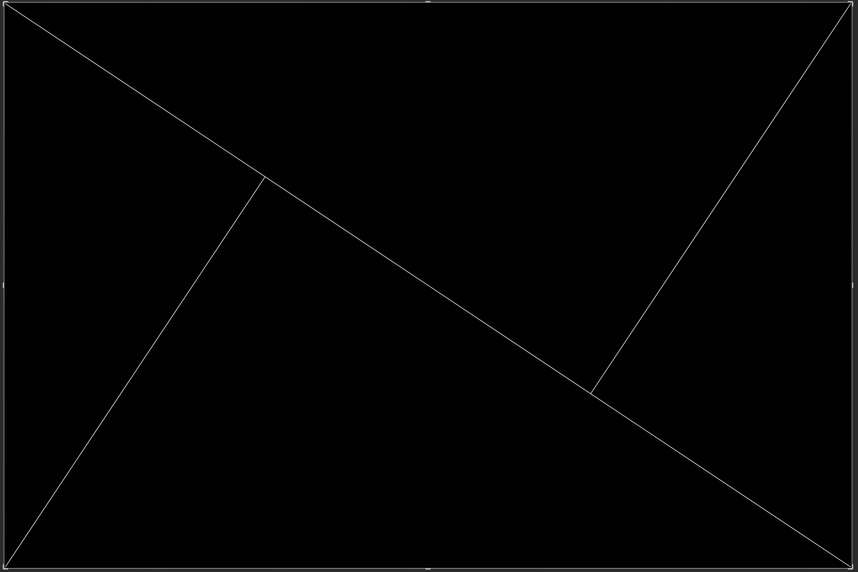
The Triangle Overlay (sometimes called the “golden triangle” guide) divides your image with a diagonal line and two smaller lines from the other corners, forming triangular sections. In other words, it breaks the frame into four triangles by drawing one major diagonal and intersecting it with lines from the opposite corners at right angles. Artists have used this concept for ages (even classical painters employed it for balanced yet dynamic compositions). The overlay’s lines show leading diagonals and intersection points that can help you place important elements in a compelling way.
When you activate the Triangle overlay, look for where the corner lines meet the main diagonal – those intersection points are great spots to position key subjects or features. Align strong leading lines (like a road, river, or building edge) along the diagonal to draw the viewer’s eye through the scene. This overlay combines balance with energy: it’s roughly a blend of the Rule of Thirds and a diagonal composition, giving you a nice mix of stability and movement in the photo. Use it to create a sense of motion and flow while still keeping the composition harmonious. (Tip: If the diagonal is not oriented the way you need, press Shift+O to flip or rotate the overlay.)
When to use the Triangle overlay:
Landscape photography: Great for scenes with strong diagonals. For example, you might have a mountain ridge or a river running from a corner. Using the Triangle guide, you could align the river along the diagonal and place a focal point (like a tree or mountain peak) at one of the triangle’s intersection points. This leads the viewer’s eye naturally through the landscape.
Street or architecture: If your shot includes a road, staircase, or roofline at an angle, the Triangle overlay can help. You can position a street or shadow along the diagonal, making the image more dynamic. For instance, imagine a street scene where a crosswalk or row of lampposts cuts across the frame – aligning that with the overlay’s diagonal adds energy.
Creative portraits or still-life: While portraits often use other guides, you can get creative by using diagonals. Perhaps you have a subject leaning or a dancer jumping at an angle. Align their body or gaze along the Triangle overlay’s diagonal for a more energetic composition. In still-life scenes (or flat lays), you might arrange objects so that one falls at an intersection and another follows a diagonal line, adding flow to the setup.
Golden Ratio Overlay – The Phi Grid

The Golden Ratio has a mystical reputation in art and nature. It’s approximately 1:1.618 and is often denoted by the Greek letter phi (φ). This proportion appears in nautilus shells, sunflowers, classical architecture, and Renaissance paintings – it’s long been thought to produce naturally pleasing layouts. In Lightroom’s crop tool, the Golden Ratio Overlay looks similar to the Rule of Thirds grid, but the divisions aren’t equal thirds; instead, they’re based on that 1:1.618 ratio. The result is a set of lines a bit closer to the center than the thirds lines (roughly 38% in from each side, instead of 33%). So the overlay still gives you intersecting lines and “sweet spots” near the intersections, but following a different proportion.
Using the Golden Ratio overlay can yield a more subtle balance in your composition compared to the Rule of Thirds. Because the lines are nearer the middle, placing a subject at a golden ratio intersection is a bit more centered than the rule-of-thirds, which some photographers feel can create a more harmonious, less extreme off-center look. For example, you might have a portrait where the Rule of Thirds would put the person’s eyes quite close to the top edge, but the Golden Ratio grid places them slightly lower – some find this more naturally balanced. In a landscape, a horizon aligned on a golden ratio line will give more sky than the bottom third would, but not as much as half the frame, which can be a nice compromise if the sky and land both have importance. The Golden Ratio overlay is rooted in centuries of art theory, and it’s a great tool if you want to experiment with composition beyond the standard thirds. It’s beneficial if you suspect that a photo might benefit from a touch of divine proportion – when you want a composition that feels organic and refined. Some photographers ultimately prefer the next overlay (the Golden Spiral) to visualize this concept, but it’s worth trying both to see which clicks for you.
Golden Spiral Overlay – The Fibonacci Curve
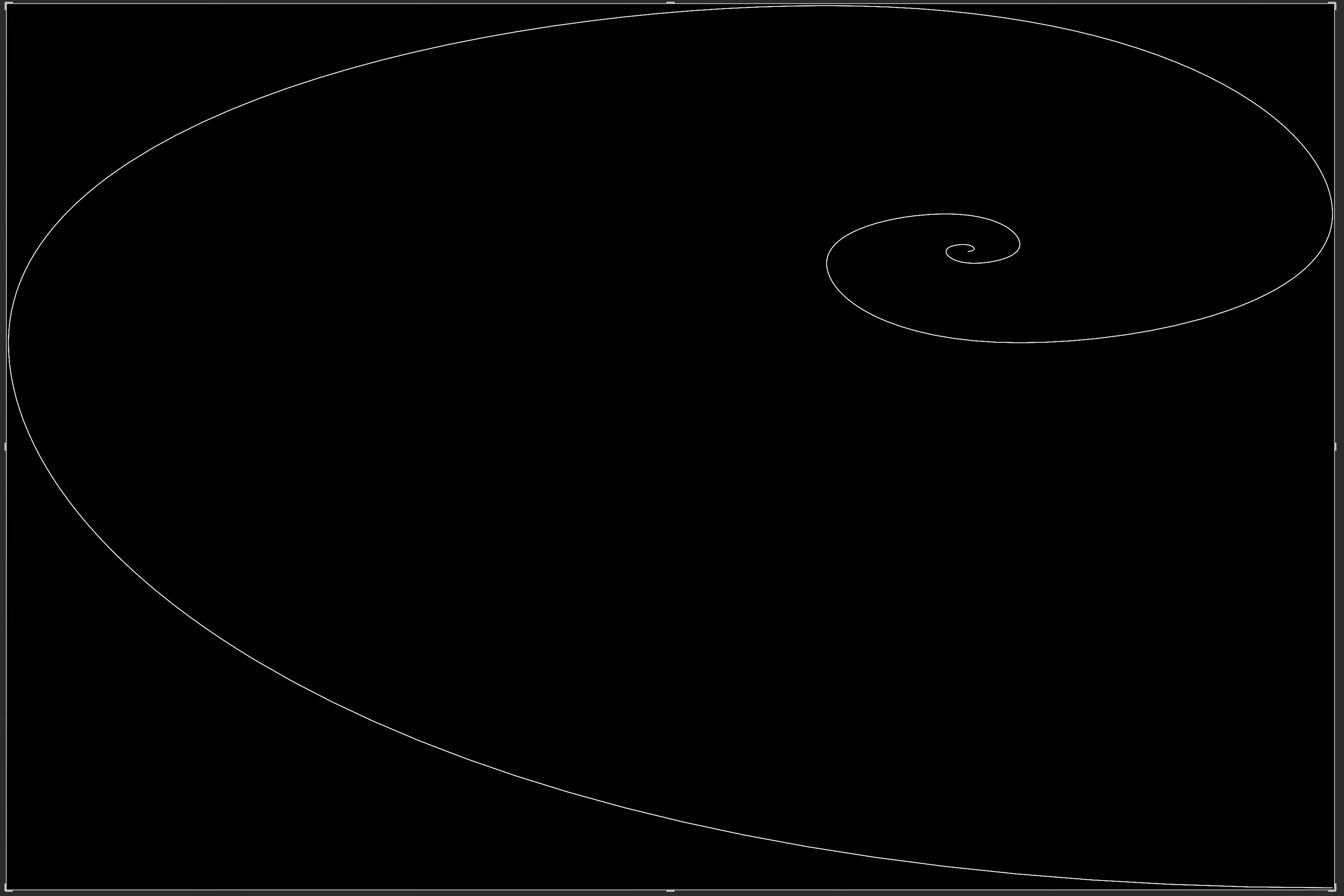
Perhaps the most visually distinctive overlay in Lightroom is the Golden Spiral. This guide displays a curled spiral shape, like a nautilus shell or a swirling galaxy, over your image. The spiral is directly related to the Golden Ratio – in fact, it’s based on the famous Fibonacci sequence, which converges on the golden ratio as it grows. If you were to draw increasingly large rectangles in the golden ratio and then round off their corners, you’d get this spiral. It starts small in one corner of the frame and expands outward, getting wider as it curves toward the opposite corner.
The Golden Spiral overlay is a powerful aid for creating a natural flow in your composition. Photographers use it to guide the viewer’s eye in a gentle curve through the scene, ideally landing on the main subject at the spiral’s tightest end. For instance, imagine a photo of a winding garden path that leads to a fountain. With the spiral overlay, you might rotate the spiral (Lightroom lets you rotate the spiral’s orientation) so that the path roughly follows the curve of the overlay into the frame, and the fountain sits right at the spiral’s center or endpoint. The idea is that the viewer’s gaze will enter along the spiral’s arm and end up exactly where you want — on the focal point. This overlay works great when your image has leading lines, curves, or an arrangement of elements that can be arranged in an arcuate flow. It can be trickier to use on very static or geometric scenes, but for organic subjects – like flowing water, spiral staircases, or swirling clouds – it’s a gem. Even when a scene doesn’t obviously have a spiral in it, I sometimes check the crop with a golden spiral to see if I can discover a more engaging way to lead the eye. It’s one of those tools that stems from classical art theory (some say painters like Leonardo da Vinci composed with spirals), yet it finds modern use by helping create images that feel right to look at. (Tip: If the diagonal is not oriented the way you need, press Shift+O to flip or rotate the overlay.)
Aspect Ratio Overlay – Framing for the Output
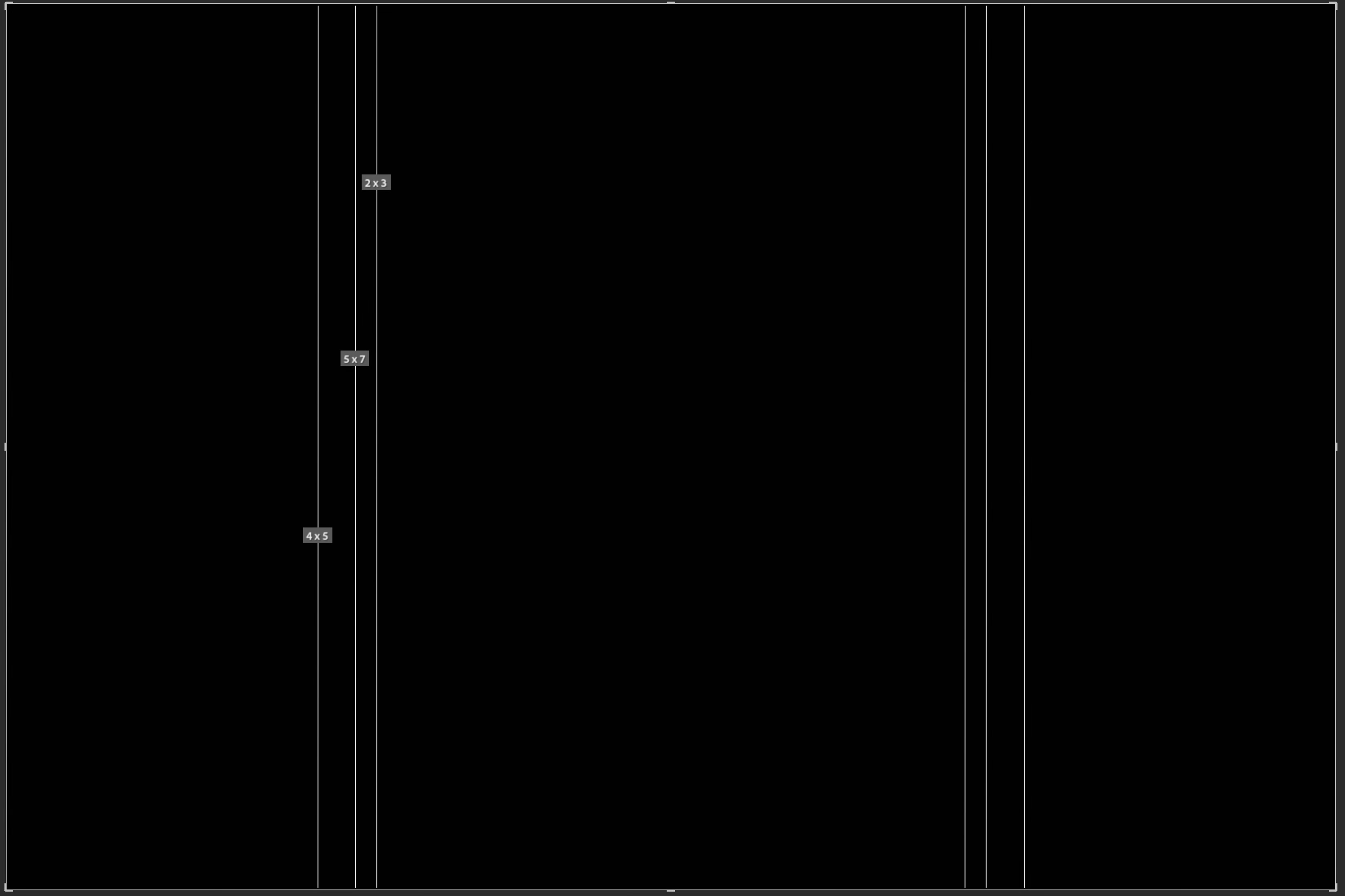
The Aspect Ratio Overlay is a bit different from the others. Instead of representing an artistic rule, it’s a practical guide to help you compose with a specific output format in mind. Photographers often need to crop their images to fit characteristic aspect ratios – for example, a 5×7 print, a square Instagram post, or a 16:9 widescreen display. The Aspect Ratio overlay in Lightroom allows you to visualize those proportions as you crop. Essentially, it can superimpose one or more common aspect ratio frames within your image as guides.
Why is this useful? Imagine you plan to print a photo as an 8×10 inch (which is a 4:5 aspect ratio) for a frame on your wall. Your original photo might be a different shape (say, 3:2 from your camera). If you just crop by eye, you could accidentally position your subject in a way that looks fine at 3:2 but ends up too close to the edge or oddly placed once you finalize the 4:5 crop. By turning on a 4:5 aspect ratio guide while editing, you can ensure that essential elements will sit comfortably within that final frame. The overlay might show, for instance, a rectangle that represents the target aspect ratio so that you can compose within it. It’s like looking at your image with the eventual picture frame or screen in mind. This overlay is best used when you already know the intended output format of the photo. If you’re preparing images for a video slideshow (16:9 ratio) or designing a magazine cover (maybe 8.5×11), you can enable the corresponding guides and adjust your crop so nothing critical gets cut off and the composition is optimized for that shape. In short, the Aspect Ratio overlay helps bridge the gap between artistic composition and real-world requirements of printing or publishing.
When (and Why) to Break the Rules
Having covered all these guides, it’s important to emphasize one thing: compositional rules are meant to be helpful, not limiting.
Allow me to repeat that:
The compositional rules are meant to be helpful, not limiting.
Overlays are tools to aid your creativity, not chains to restrain it. You’ve probably heard the saying, “Learn the rules like a pro so that you can break them like an artist.” I love this quote (often attributed to Pablo Picasso) because it rings true in photography. By all means, learn and use these classic guides – they frequently lead to strong images. But also know that some of the most striking photos out there succeed precisely because they don’t follow the conventional rules.
For example, while the Rule of Thirds advises against centering your subject, there are times when a centered composition is compelling. A symmetrical scene, like a reflection on a still lake, often looks best with the horizon dead-center, creating a mirror effect. Portraits can be intensely engaging with the subject’s face smack in the center, staring straight at the camera, defying the off-center convention to convey strength or directness. If I’m shooting a building with perfectly even architecture, I might center it and use the Grid (or a dedicated Center overlay) to nail symmetry, ignoring the thirds entirely. The key is that you, the photographer, are in control – not the rule.
Another reason to sometimes ignore the overlays is when following them would detract from the story or emotion of the photo. Maybe you have a composition where breaking symmetry or placing something oddly in a corner creates tension or a sense of unease that suits the mood. Or perhaps the light and shadows in your scene naturally draw the eye in a way that doesn’t align with any guide – that’s okay! Trust your instincts in those moments. The guides should serve your vision, not the other way around.
In my own workflow, I treat these overlays like a suggestion box. I’ll check a crop with a few different ones (Lightroom makes it easy to cycle through them) to see how the scene responds. Sometimes a photo clearly “clicks” with one of the guides – it’s like finding the puzzle solution for balance. Other times, none of them feel quite right, and that’s when I’ll abandon them and go with my gut. Composition is an art, not a science, and while the science (or math) of grids and ratios is fascinating and valuable, the art sometimes asks for breaking formulas.
In my view, crop guide overlays are fantastic educational and practical tools. They can train your eye to see balanced proportions and help you experiment with different framings. For beginners, they’re like having a gentle instructor inside Lightroom, nudging you toward time-proven layouts. For experienced shooters, they’re a quick check or a source of inspiration for a different crop you hadn’t considered. Use them to explore possibilities: you might discover your image looks best with a golden spiral you hadn’t envisioned, or you might confirm that centered was the way to go all along. And remember, whether you adhere to a Grid, Thirds, Fifths, Golden Ratio, a Spiral, or none of the above – what ultimately matters is the impact of the final image. If it resonates with you and your audience, then it’s composed perfectly, rules be damned.
Some of the Places You Can Find Me:
My Website: https://www.anthonymorganti.com/
My YouTube Channel: https://www.youtube.com/@anthonymorganti
WOW! I taught photography for five years and never went 1/4 as deep as you did. So thorough!
My personal take is that you should have these “in mind” while you shoot but you should never let these guides keep you from clicking the shutter when you need to.
Photo editing is a art within itself and I love using these guides especially when laying out photos with text
Excellent work!
I wonder whether there's the possibility to have those grids superimposed in cameta, ehilr shooting